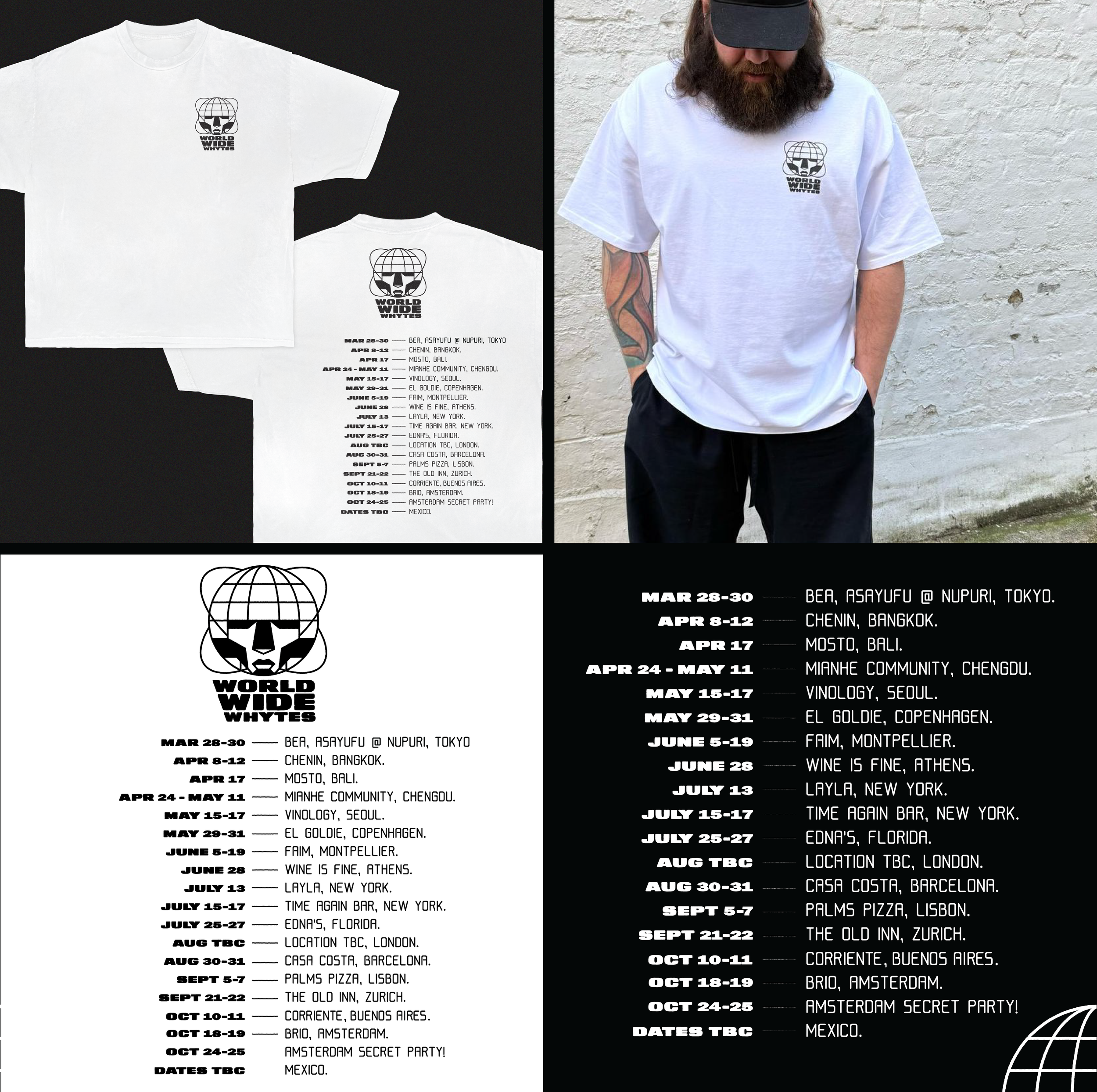
World Wide Whytes Branding
Client: Whyte’s
Service: Brand Identity
Following a hugely successful year with his debut restaurant in Hackney, acclaimed chef Whyte Rushen set off on an ambitious global culinary tour.
We partnered to craft a bold and adaptable visual identity that could travel with him, while allowing each stop to have its own unique expression.
The main logo, inspired by early 2000s aesthetics, was kept intentionally minimal in both design and colour palette. This allowed the core identity to remain recognisable, while leaving room for each individual location to be fully reimagined.

For every city and venue on the tour, we developed bespoke sticker packs, posters, and menus each deeply rooted in the local culture, cuisine and community. These materials were designed to feel stylistically distinct from the overarching brand, ensuring every event felt fresh, exciting and reflective of the unique energy Whyte brings to his food.
Much like collecting travel stamps in a passport, the varied design approach
gave each event a memorable, place-specific imprint, marking the journey in visual form. The result was a living archive of the tour, with each identity serving as a creative memento of the cities and stories behind the dishes.
This approach created a dynamic and evolving visual language that mirrored
the creativity and spontaneity of Whyte Rushen’s food.