Big Red Pizza Tour
Client: Storekit & BiteTwice
Service: Event Branding
The Big Red Pizza Tour was a collaboration between food review platform BiteTwice and hospitality-focused delivery service StoreKit. Designed to celebrate some of London’s finest independent pizzerias, the concept was simple: pack a Routemaster-style bus full of pizza lovers and take them on a curated tasting journey across the capital’s most iconic pizza spots.
We were brought in to develop a visual identity for the event that would feel as exciting and flavour-packed as the pizzas themselves.
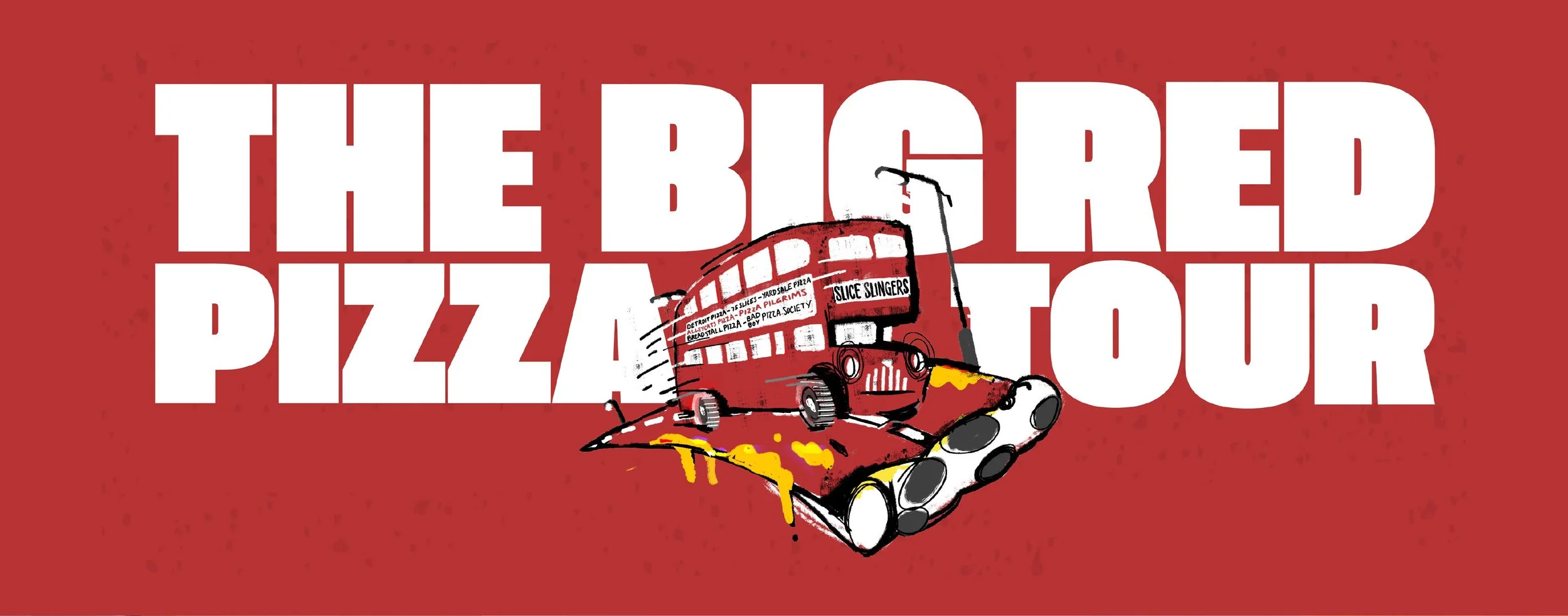
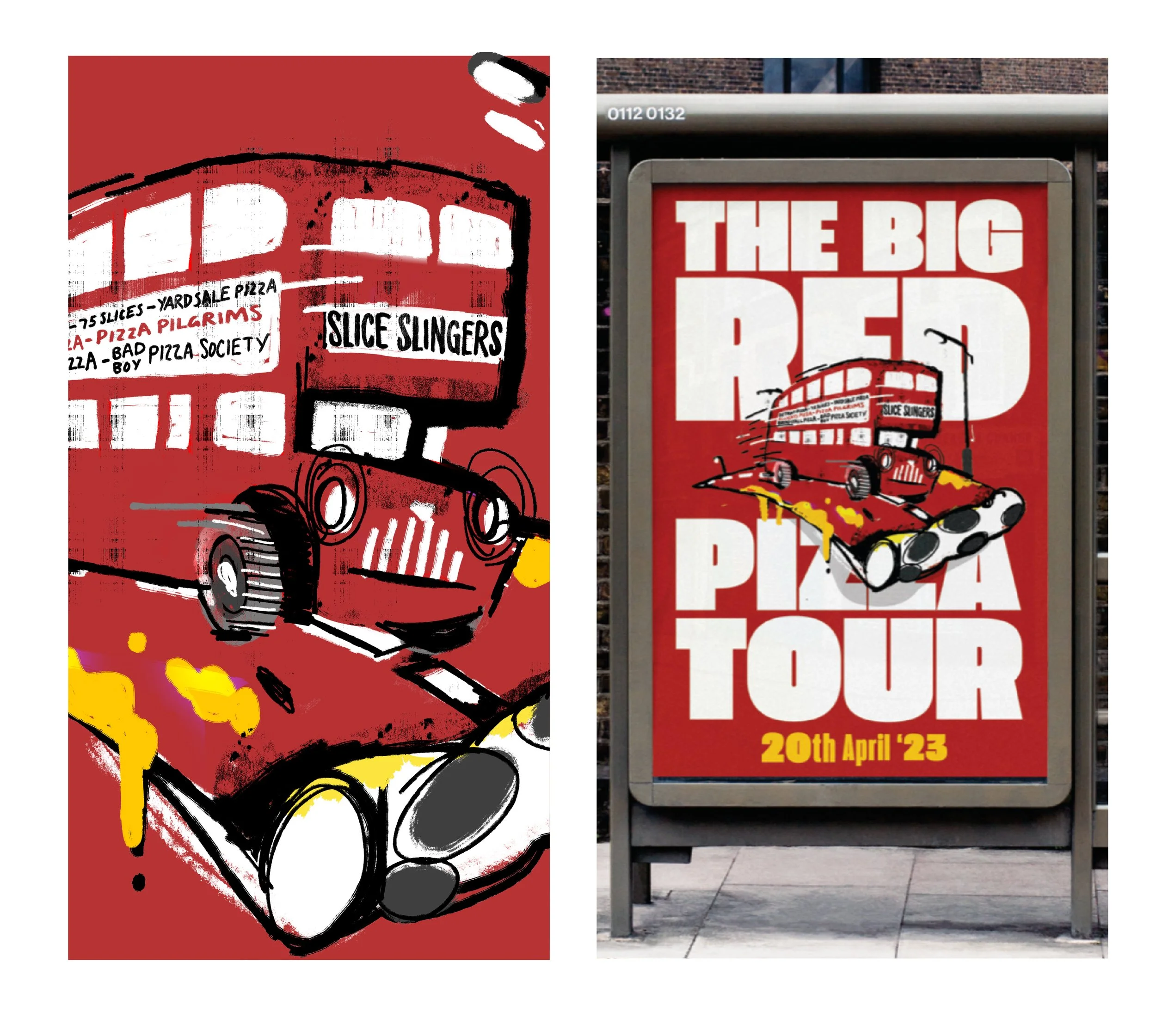
At the heart of the identity was a hand-drawn illustration: the iconic red London bus reimagined as it barrels down a giant slice of pizza.
We paired this with a confident slab serif typeface to create a bold logotype that stood out across digital and print touchpoints. The combination of playful illustration and impactful typography helped build instant recognition and buzz around the tour.
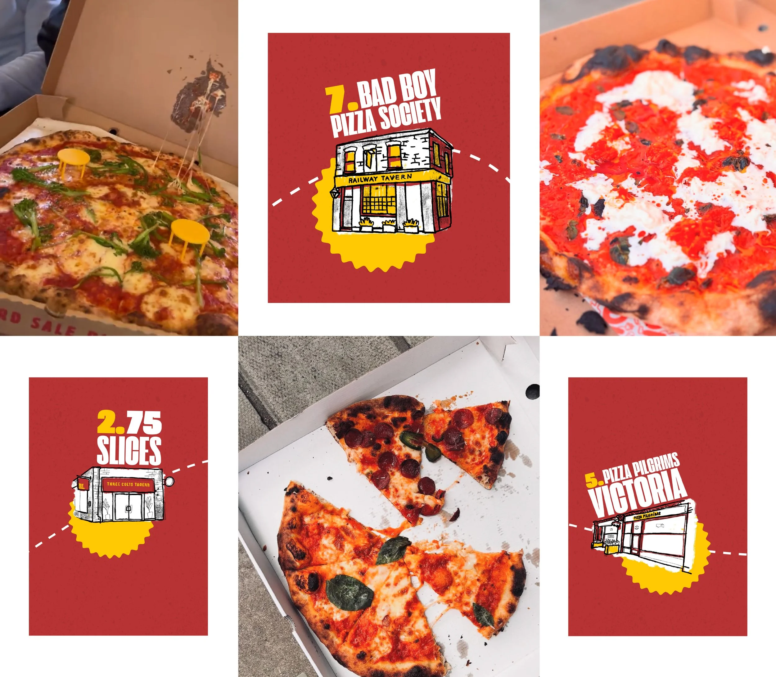
We leaned heavily into hand-drawn illustrations to give the brand an artisanal, crafted feel, mirroring the nature of the pizzerias themselves. With this style for the brand established, we created a fully illustrated “pizza route” map.
All these elements became central to pre-event communications. The map wasn’t just functional, it was a piece of art. Shared on social, embedded in emails and printed on flyers and posters, it helped generate hype and gave attendees a tangible sense of the journey they were about to commence.
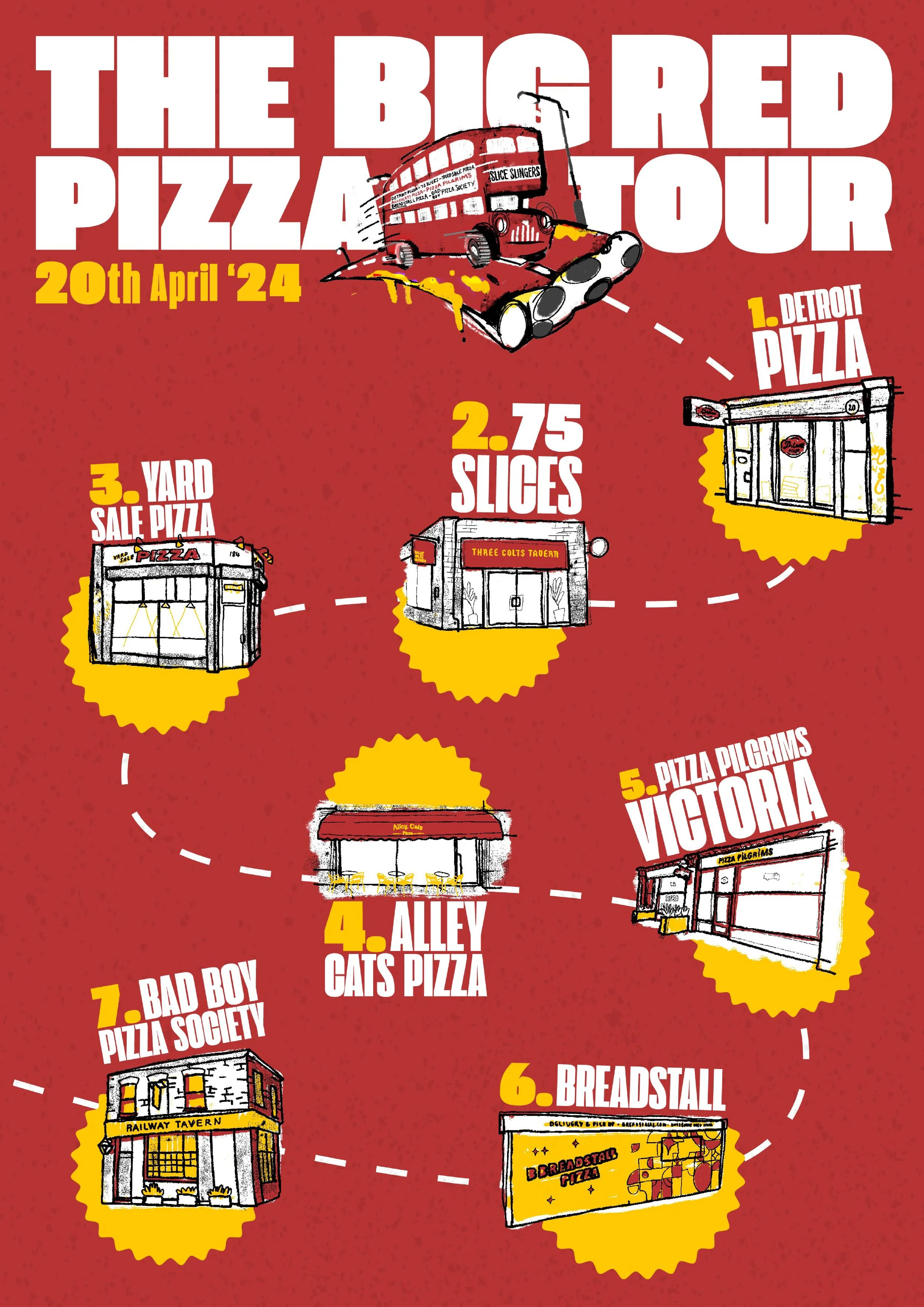
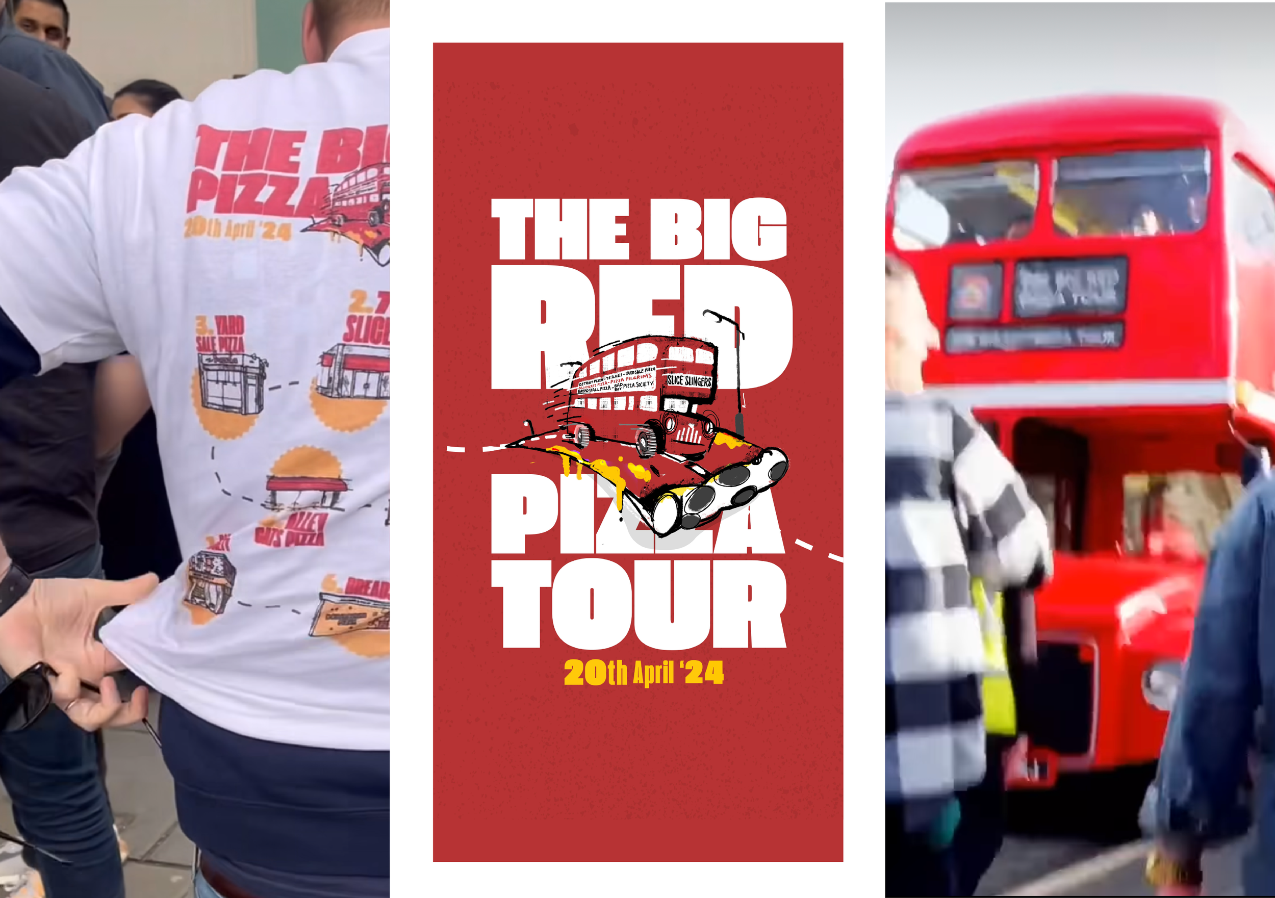
To bring everything together on the day of the tour, we printed custom event t-shirts featuring the full illustration map. Not only did this create a unified look among event staff and attendees, but it also served as a fun takeaway.
The branding played a key role in building early excitement and driving ticket sales. The hand-drawn assets gave the event an authentic, grassroots feel. By combining illustration-led storytelling with bold visual branding, we created an identity that was both distinctive and deliciously memorable.